Quality Scores
TestGen quality scores quantify the health of your data by measuring the ratio of clean data to total data. Scores are computed automatically from profiling results and test outcomes, giving you a single metric to track data quality over time. Use scorecards to define which slices of your data to score and monitor on the Quality Dashboard.
What quality scores measure
Quality scores combine results from two sources:
- Profiling scores — Based on hygiene issues detected during data profiling. Each anomaly has a prevalence (the actual or estimated fraction of records affected), and these are combined across columns to produce a score.
- Testing scores — Based on failures detected during data quality testing. Each test failure's prevalence contributes to the score in the same way.
The overall quality score is the product of these two components: overall_score = profiling_score x testing_score. This means both profiling and testing must show strong results for the overall score to be high.
Key behaviors:
- If you dismiss a hygiene issue or test failure, it no longer affects the score.
- When a column has multiple issues, prevalences are combined probabilistically rather than summed, so overlapping issues do not inflate the score impact.
- Scores are weighted by table and column importance — see How scores are calculated for the formula.
- Monitor results are excluded from quality scores. Monitors track operational patterns separately — see Monitor Tables.
Scorecards
A scorecard is a saved definition that specifies which subset of your data to score and how to display the results. You can create multiple scorecards to track quality from different perspectives — for example, one scorecard per business domain, one for critical tables, or one for each data source.
Each scorecard can display:
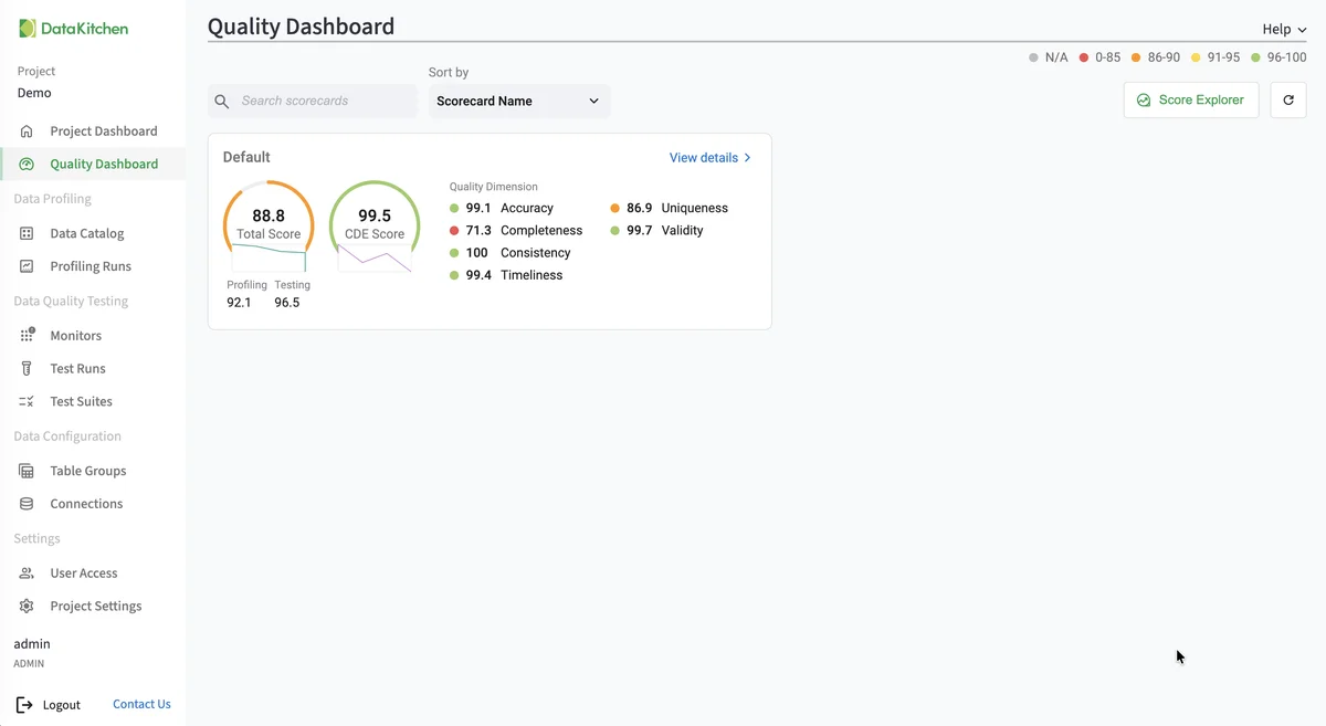
- Total Score — The overall quality score across all matching columns.
- CDE Score — A separate score computed only from columns flagged as Critical Data Elements, highlighting the quality of your most important data.
- Category breakdown — Score indicators for each value within a chosen category (such as Table Group, Business Domain, or Quality Dimension).
Scorecards appear as tiles on the Quality Dashboard, each showing live scores and a history sparkline. Scores refresh automatically after every profiling or test run.
Getting started
To begin using quality scores, you need at least one completed profiling run and one completed test run for a table group. Once you have results, use the Score Explorer to explore score breakdowns and save a scorecard. See View Score Details for investigating trends and drilling into issues.
Tip
The Data Configuration Setup and Add Table Group wizards can create a scorecard for a table group as part of their setup flow.
Reference
How scores are calculated
At any level, the score represents the percentage of clean data points relative to the total number of data points at that level. After every profiling or test run, TestGen computes a data quality score starting at the column level and rolling up from there.
The rollup applies an importance weight to each column. This means an issue on a primary key in a small dimension table can affect the overall score more than the same issue on a low-cardinality flag in a large fact table, so quality problems in critical tables are not hidden by larger but less consequential ones. Weights are derived from semantic metadata collected during profiling.
Table importance is derived from the table's semantic type.
| Table type | Weight |
|---|---|
| Entity (master, dimension) | 10× |
| Domain (reference, lookup) | 5× |
| Bridge (linking tables) | 5× |
| Summary (aggregations) | 1.5× |
| Transaction (fact tables) | 1× |
Column importance is derived from the column's semantic data type.
| Column type | Weight |
|---|---|
| ID, surrogate key, unique ID | 3× |
| Foreign key | 2.5× |
| Email, phone, person name, entity name | 2× |
| Address, date, measurement, code | 1.5× |
| Boolean, category | 1× |
| Flag, attribute | 0.75× |
| Description, constant, sequence | 0.5× |
Columns flagged as containing PII receive an additional multiplier on top of the column weight, reflecting their elevated regulatory and breach-risk importance.
Other rules:
- When a column has multiple issues, prevalences are combined probabilistically rather than summed, so overlapping issues do not inflate the score impact.
- A scorecard's overall score combines the profiling score and testing score.
- The CDE score uses the same calculation but only includes columns flagged as Critical Data Elements.
Importance weighting is controlled per project by the Use weighted data quality scoring setting on Project Settings. With it off, every record contributes equally to the score regardless of its table or column.
Score color thresholds
- ● Green (96%+) — Strong quality. Very few issues.
- ● Yellow (91-95%) — Warrants attention.
- ● Orange (86-90%) — Below expectations. Investigate.
- ● Red (below 86%) — Poor quality. Action needed.
Score breakdown categories
Scores can be broken down by category for analysis. Categories draw from metadata on your table groups, columns, and test types:
- Column Name, Table Name, Table Group — Pinpoint which specific data assets have issues.
- Impact Dimension — Break down by the operational impact a failure would have: Conformance, Regularity, Reliability, or Usability.
- Quality Dimension — Break down by Accuracy, Completeness, Consistency, Timeliness, Uniqueness, or Validity.
- Semantic Data Type — Group by profiling-inferred type (Email, Phone, Date, etc.).
- Data Location, Data Source, Source System, Source Process — Group by data origin.
- Business Domain, Stakeholder Group — Group by organizational ownership.
- Transform Level, Data Product, Data Classification — Group by data pipeline stage, product, or sensitivity level.